[bu:r]
We create bespoke experiences for every occasion.
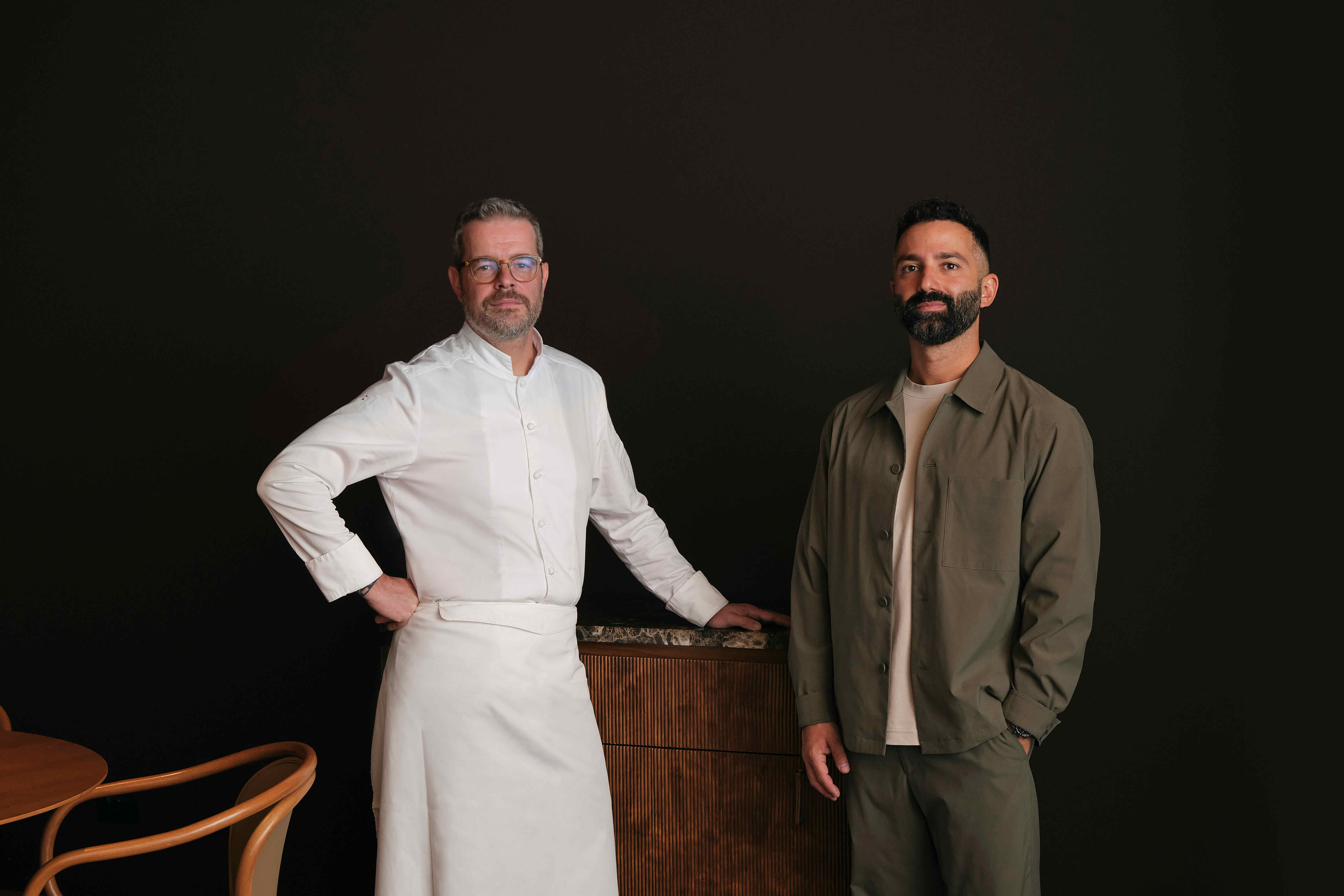
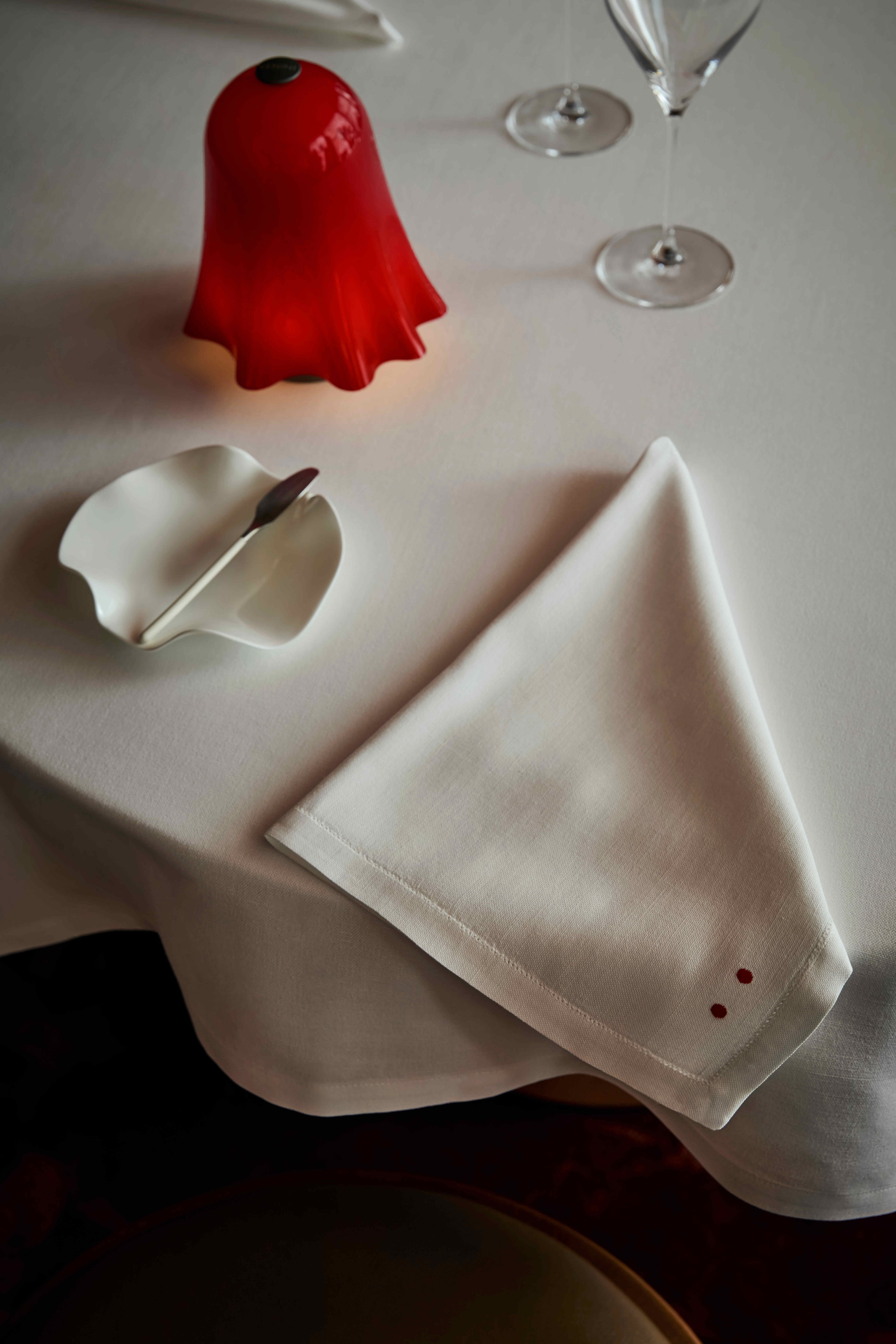
The [bu:r] brand was born from the collaboration between the chef Eugenio Boer and the designer Gianluca Carone, restaurant brand identity curator. After an intense research, a very simple and elegant logo was born; the phonetic transcription of chef’s surname. The iconic two red dots, repeated many times in the coordinated image and details of the restaurant, represent the extreme synthesis of the balance between innovation and tradition. Subsequently, the graphic communication of the Chef and the [bu:r][bu:r] family was entrusted to art director Eleonora Moretta.
After nearly seven years, [bu:r] is renewing its spaces and expanding its vision, continuing to strike a balance between innovation and tradition.
This new chapter confirms and strengthens our partnership with kick.office, the studio led by Mario Abruzzese, which has translated the sensitivity of Chef Eugenio Boer and Carlotta Perilli into architectural language from the very beginning. Today, this collaboration is renewed, guiding the restaurant towards the future with coherence, care, and vision.
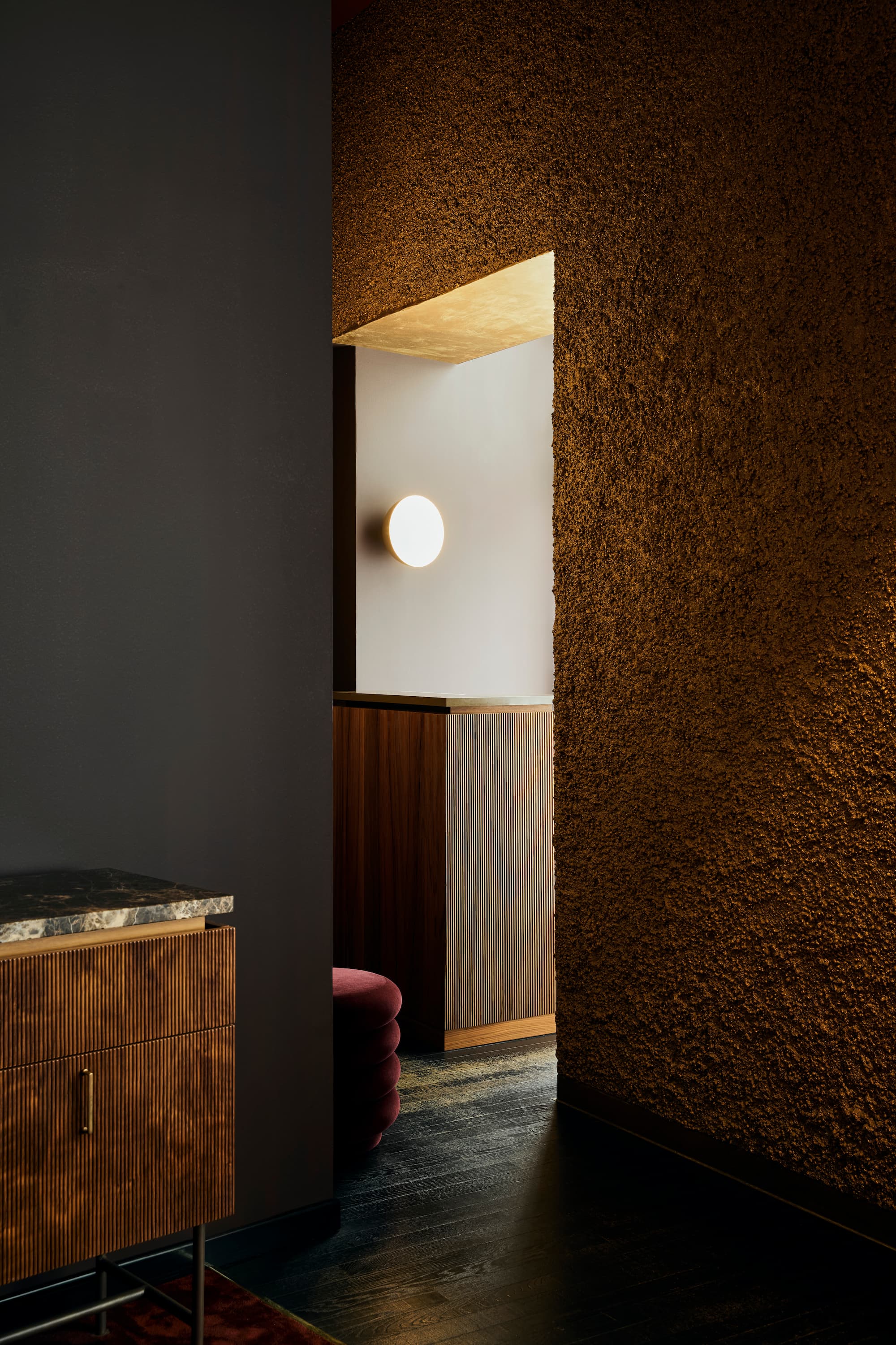
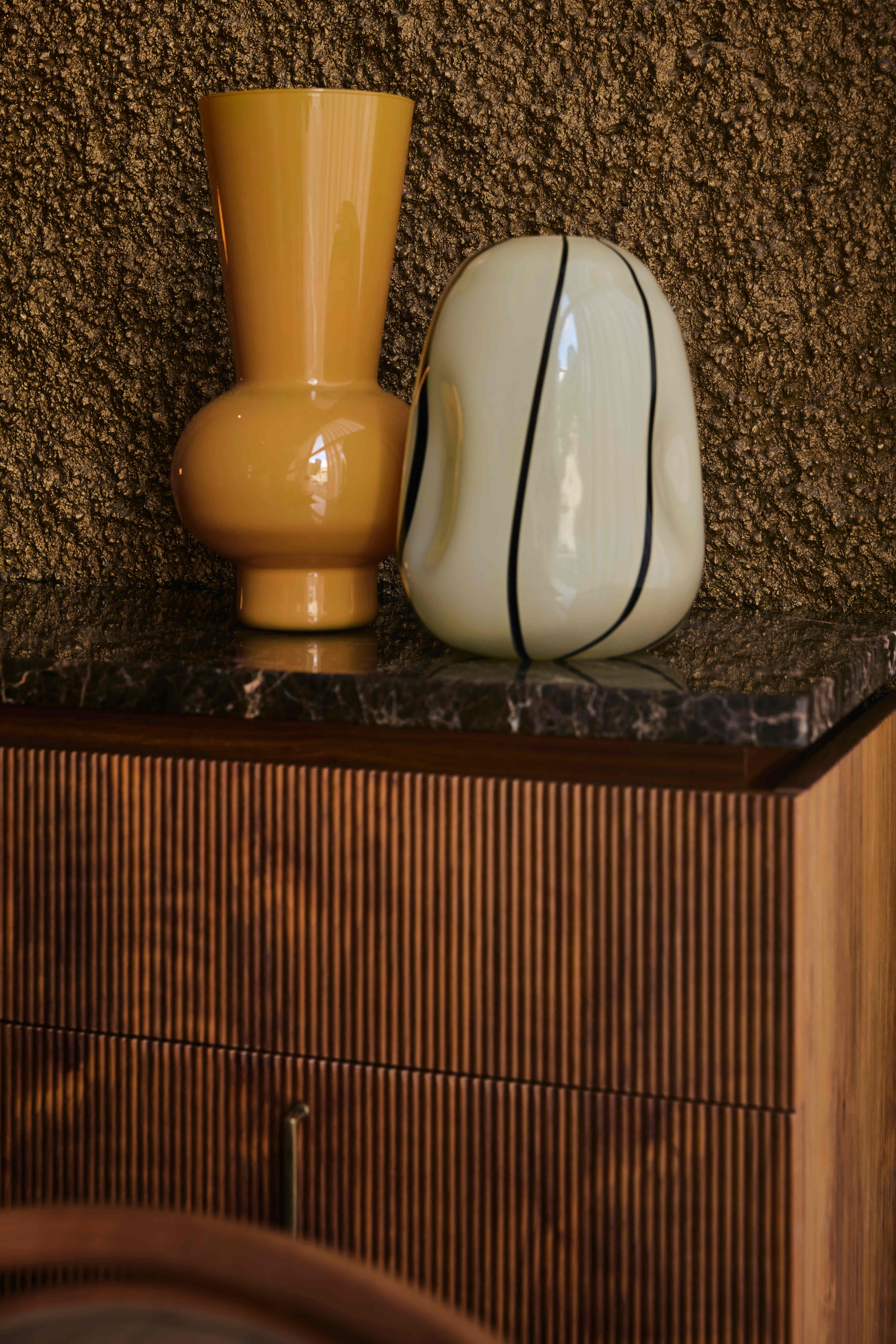
Inspired by the suggestion of friend and architect Leandro Fedele, kick.office has adopted a harmonious and elegant chromatic proposal, transforming it into a palette that is coherent with the restaurant's philosophy: warm and dense tones, inspired by the colors of the earth, which sublimate the atmosphere into a more intimate and welcoming setting.
The new solid beech wood tables, designed by TON, become a symbol of connection with nature and craftsmanship, bringing renewed elegance to the dining room that dialogues with what remains unchanged: the icons that have accompanied the restaurant in these first seven years, now reinterpreted in new perspectives.
Light, natural or designed, remains the protagonist, completing the journey: it adapts to the new needs of the restaurant, transforming with the passing hours and modulating with harmony, to always offer comfort, conviviality, and intimacy.